LocAlly Case Study
Resurfacing and storing locations appropriately
- Role:
- UX researcher/designer
- Team:
- 1 UX research/designer, 1 software engineer
- Skills:
- UX Research, User interviews, UI Design, User testing, Branding
- Tools:
- Pen & paper, Sketch, Invision
About LocAlly
I wanted to create a real world project where I could practice my UX knowledge and develop new skills. I found the problem of finding a better way to save and retrieve interesting places and tried to solve it with my project called Locally.
This case study describes Locally's UX process of discovery, validation, design and testing.
Interviewing process
I spent a few weeks being more aware of people's frustrations through everyday conversations and came up with a few potential problems. The struggle of saving and retrieving interesting places was the first one validated.
To validate this problem, I created a UX research plan and interviewed 6 people. The main questions I wanted answers from were:
- What kind of places would you like to go to?
- How do you remember places you would like to go to?
- How do you find the places you would like to go to?
Some common threads came up:
- Most people used multiple ways to store locations they were interested in, including note-taking apps for different devices, text documents, pieces of paper or just memory.
- When looking for local places to go out or looking for cool places when visiting a new city, it was hard to know where to go.
- Opportunities to visit places were lost as places were forgotten, distance misjudged and planning lacking.
Empathy map & Personas
An empathy map helped me organize interviews' results into users' feelings and actions.
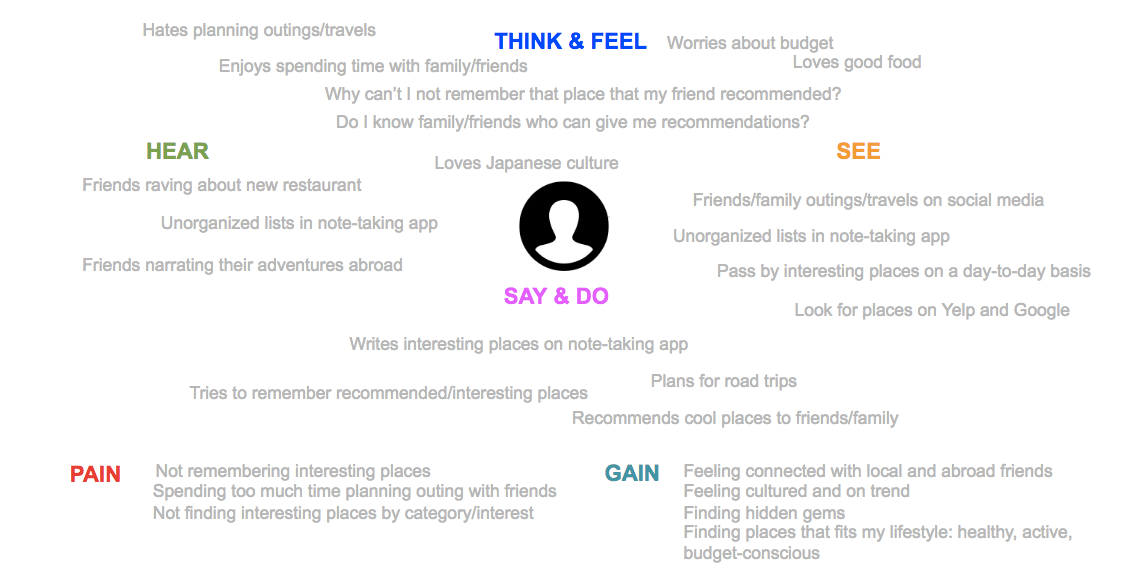
Two personas with different motives and lifestyles were created to represent our audience.

I always enjoy having good food with good company.
Tim
- Age:
- 28
- Gender:
- Male
- Family situation:
- Single
- Location:
- Los Angeles, CA
- Occupation:
- Software engineer
- Interests:
- good food, video games, martial arts, biking, climbing
- Technical comfort:
- High
- Devices:
- too many to count
- Backstory:
- Tim has lived in Los Angeles, CA for 4 years now. He has previously lived in Japan, France and Australia and has kept in touch with friends there. As an introvert, he doesn't like to go out by himself but enjoys knowing which restaurant to go to when going out with friends. He gets a lot of recommendations from his family/friends abroad, local friends, coworkers, acquaintances but doesn't have a good system to store these recommendations and have them resurfaced when the appropriate time and location comes.
- Goals & Motivations:
-
- Easily find good restaurants to go to, when at home or traveling
- Store recommendations in one place
- Enjoy good food with good company
- Frustrations:
-
- Does not have one place where interesting places are stored, instead uses his brain, notes, google maps bookmarks
- Does not have location resurfacing when time and location is appropriate

I love rediscovering my hometown with old and new favorites.
Emily
- Age:
- 55
- Gender:
- Female
- Family situation:
- Married with 2 children
- Location:
- Houston, TX
- Occupation:
- Artist
- Interests:
- good food, tango, theater, history, arts
- Technical comfort:
- Medium
- Devices:
- iPhone, Mac laptop
- Backstory:
- Emily has lived in Houston, TX her whole life. She likes going to her favorite places but also be in the know for new and upcoming cool places. She finds her favorite spots from friends and social media.
- Goals & Motivations:
-
- Explore the cities she lives in or travel to
- Spend quality time with friends/family
- Be in the know for cool places to go to
- Frustrations:
-
- Does not have one place where interesting places are stored, instead uses memory, notes and sms
- Needs a location for a place with a particular interest and can't easily remember/find it
- Is unsure how and what app to download on her phone and usually asks her children for help
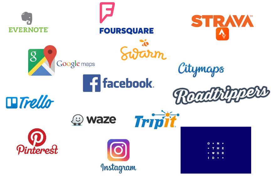
Competitive analysis
After our audience was defined, it was time to research websites/apps/tools solving problems similar to ours. The research included social media, tour guides and planning products.
This research led us to questions we will eventually have to answer:
- How to view locations?
- How to add locations?
- Do we implement notifications and if yes, how?
- How do we verify places?
- How do we categorize places?
- Can we share places and if yes, how?
- Can we plan itineraries and if yes, how?
Card sorting
Four live card sorting sessions were performed to understand how to display and organize content.
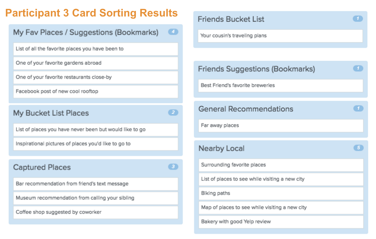
Those sessions helped us better understand the classifications of places, users' goals as well as focus on individual places and not maps or itineraries.
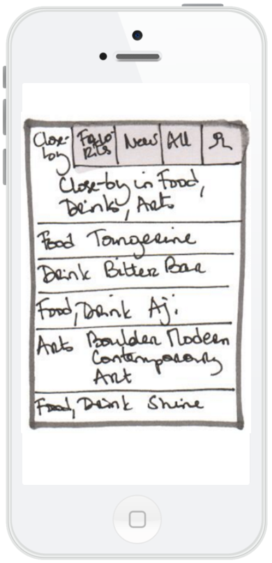
Locations were divided within 2 classifications:
- favorite, bucket list or back-pocket item
- close-by or far
Users had 4 main goals:
- recommend places to people
- find favorite places
- find places for a specific city
- find unvisited locations
Some cards ("bike paths", "maps of places to see while visiting a city" and "your cousin's traveling places") were too general and confused participants as they didn't describe a specific place. It will be more important to focus on storing/retrieving individual places than figuring out how they fit into an organized maps or itineraries.
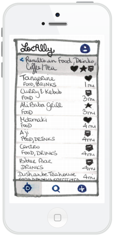
User testing v1
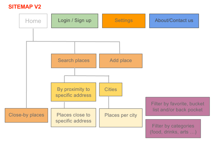
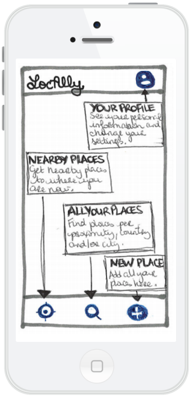
Once I understood users' goals, and places' classification better, a sitemap and wireframes were created and user testing implemented.
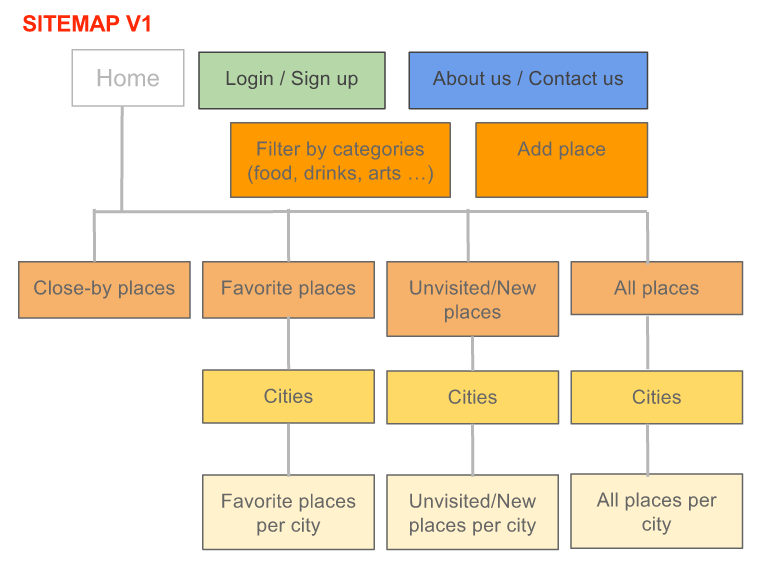
During the first round of user testing, I showed users wireframes and asked for their first general impressions: what did they think the app do? where would they click and why?
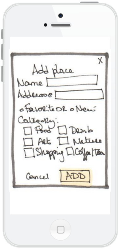
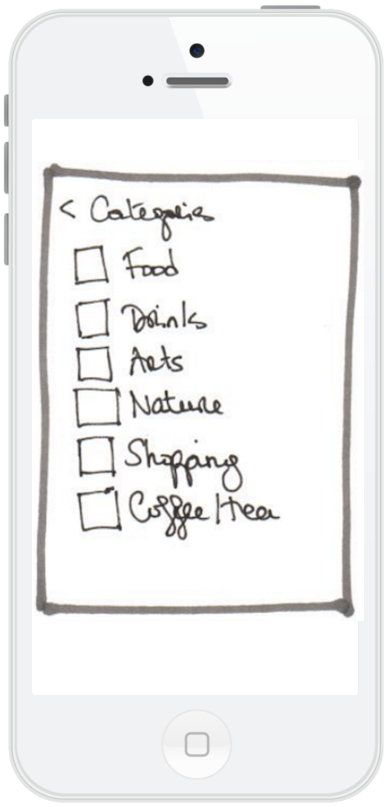
After testing the v1 wireframes, I realized that the main menu was confusing as places could appear in more than one menu items. I had to find a better way to differentiate close-by/favorite/new places and to find places per cities. The places categories feature was successful and was kept in the following version.
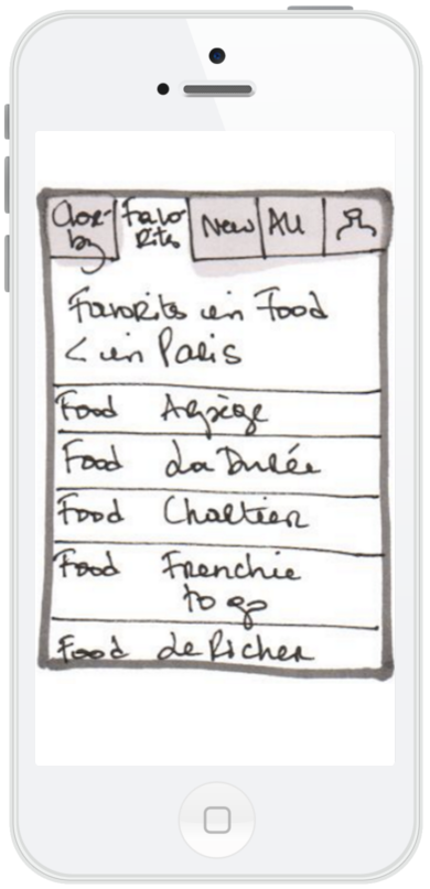
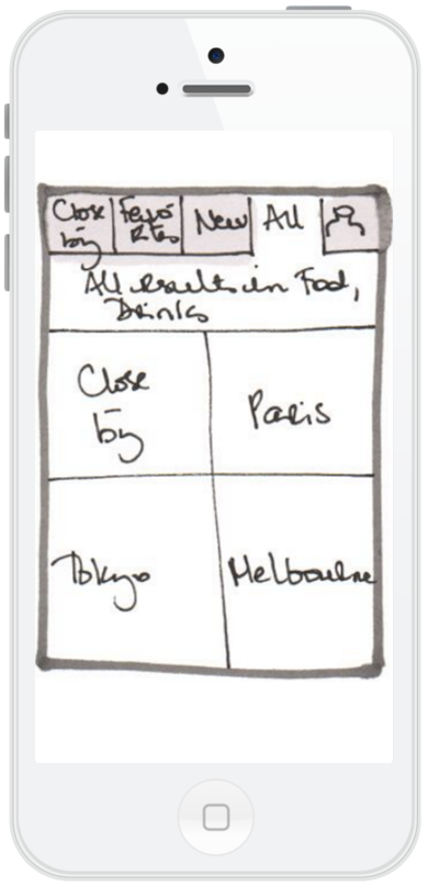
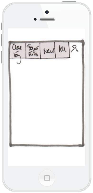
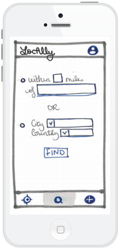
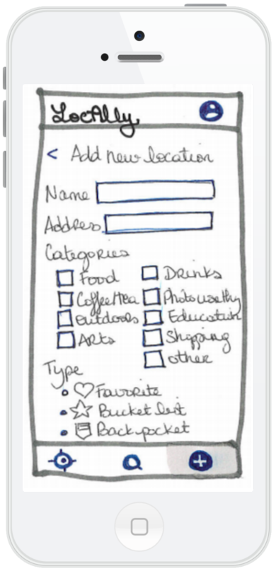
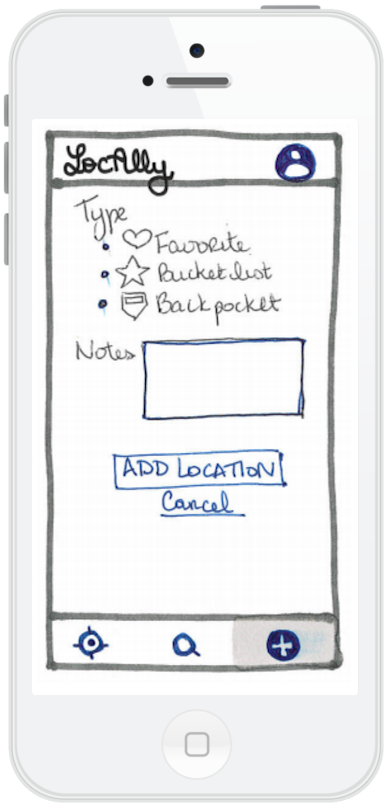
User testing v2
For v2, I rethought the main menu while still keeping the close-by/favorite/new types within the app, made city/country search easier, added on-boarding process and streamlined the look with logo and icons.
The v2 user testing consisted in 3 in-person usability sessions using a user testing script and interactive wireframes on popapp. I ask the users to perform 5 tasks:
- Describe the homepage
- Create an account
- Find closest locations to where (s)he was now
- Find locations in a specific city
- Add location
Three usability problems stood out:
- The words used for locations types (favorite, bucket list, back pocket) were confusing
- Search required too many steps
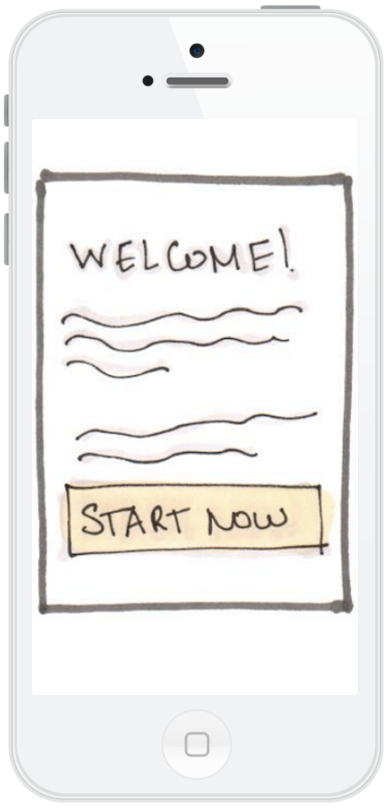
- The welcome/onboarding needs to be more in-depth
A more detailed user testing report with wireframe updates is available.

MVP & user stories
After the second round of user testing, some features were validated and some still need to be worked out but we have enough to start building a MVP.
Main features
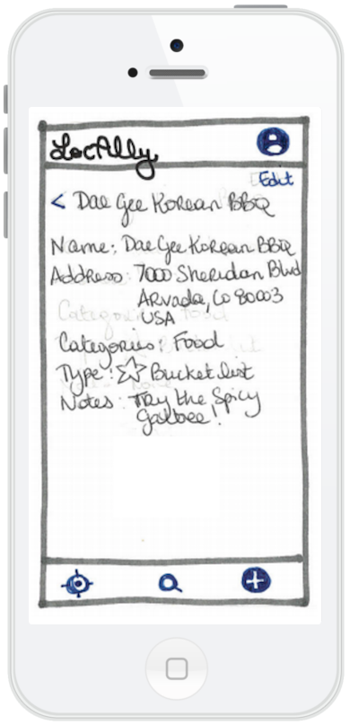
- As a user, I need to be able to see all places.
- As a user, I need to be able to see the 20 closest places.
- As a user, I need to be able to add an interesting place and see it the list of places.
- As a user, I need to be able to edit interesting places.
- As a user, I need to be able to delete interesting places.
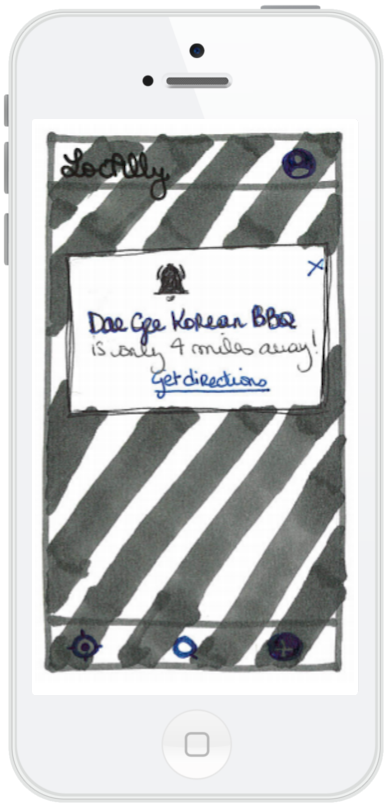
- As a user, I need to be notified when I am close-by a listed place.
- As a user, I need to view places per cities.
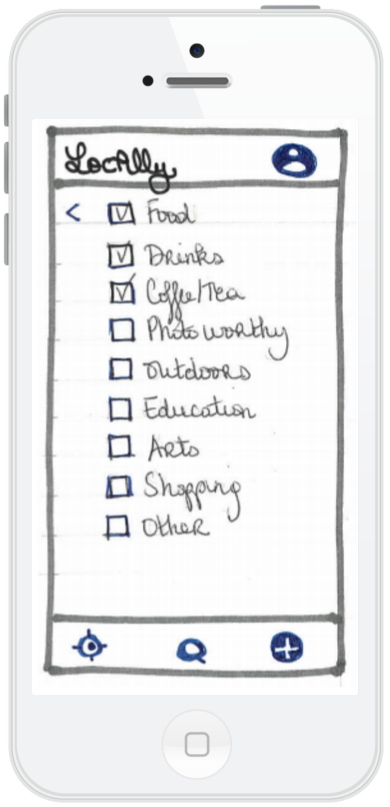
- As a user, I need to view/add/edit places with categories.
- As a user, I need to be able to filter places by categories.
- As a user, I need to view/add/edit places with types.
- As a user, I need to be able to filter places by types.
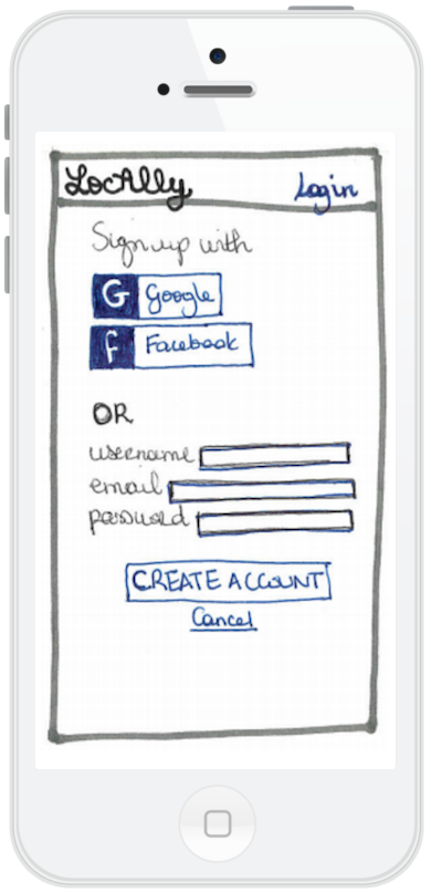
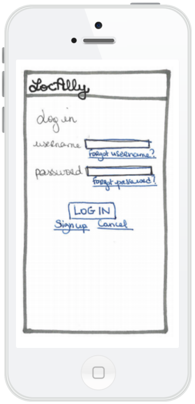
- As a user, I need to be able to register/login/logout .
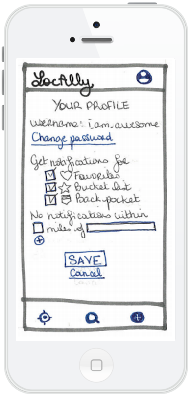
- As a user, I need to be able to fill in my default settings .
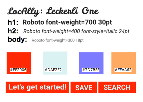
Style Guide
I want Locally to be the best, comforting and fun friend you got to when you need help to find a place to eat, to explore or just hang out. Your friend that remember your favorite restaurant but also can give you new places to try out.
This style guide share the guidelines to ensure the comforting and fun branding as well as a consistent look.
To be continued...
Once a device is chosen, MVP's user stories can start being implemented. At the same time, wireframes needs to be worked out with at least another round of user testing sessions and eventually polished wireframes following the style guide needs to be created with Sketch.
LocAlly was a fun project to practice my UX skills and become more familiar with the UX process. Since its inception, there hasn't been a week where I was with family or friends and wished just the list of places and notification part of the app was actually built. For now, I am focused on more collaborative projects but will want to continue with Sketch mockups and Android development by myself or a partner when current projects become more established.
Lessons learned
LocAlly is the first UX project I have worked on, starting from a blank state. I had no stated problem or audience, just an open mind. Going through the UX process reinforced one of my belief about design: it can be hard to make something simple. People had multiple ways to store the places they loved or wanted to try and multiple apps touched on some of those functionalities. Unfortunately, lots of those apps added cumbersome layers of social media, reviews or privacy invasion that distracted from the elements of suprise and wander that come with visiting a place.
Ultimately, being more aware of people's pains and struggles on a day-to-day basis, having a more streamlined UX process as well as not being discouraged by the availability of apps solving a similar problem are 3 lessons I'm taking with me as I move forward with my design journey.