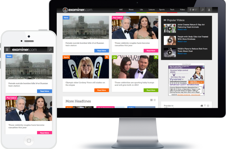
Examiner.com Case Study
Streamlining online experience accross all devices
- Role:
- full-stack web developer
- Team:
- dev team of 8, 1 product manager, 1 designer
- Skills:
- UI Design
- Tools:
- HTML5, CSS3, jQuery, PHP, MySQL, MongoDB, Drupal
About Examiner.com
Examiner.com was one of the biggest new websites and built on Drupal, a PHP content management system.
Our team of less than 10 people included a product manager, a designer and front-end/back-end/full stack developers. I was a full stack developer. Most of my days involved writing PHP, HTML5, CSS3, jQuery and the remaining time included code/design reviews and collaborating on decision-making.
Challenges
Examiner.com was built as 2 websites: desktop and mobile. In order to create a more consistent and enjoyable experience for the users and ease features update for the dev and content teams, we decided to redesign the examiner.com product with a responsive overhaul.
For a better user experience, our goals were to focus on:
- merging the 2 websites into one responsive website,
- refining the menu,
- displaying more relevant content on article pages,
- improving content creation.

Responsive design strategy
A new color palette and a better theme for content display and discovery were the base for the redesign. We made sure to use HTML5 tags, CSS3 properties and Sass to be up-to-date with the newest standards and technologies. Also, we created multiple JavaScript scripts for more real-time and interactive features, including for the creation of complex content types.
The new Examiner.com's reveal
After a few months, the new responsive website was released live successfully. The unified website, updated look and improved features were major improvements from our previous version and were a stepping stone for more user engagement and reach in future projects.
For more details on the implementation, we created a presentation that we gave to multiple meetups.

Lessons learned
The Examiner.com responsive makeover is the biggest design project I have worked on as a web developer. Because we had to combine two sets of large legacy codebase into one and implement a rebranding, collaboration with front-end/back-end/full stack engineers, designer, product manager and business stakeholders was key to deliver a beautiful and functional product on time.
Three main lessons have stayed with me from this project: refactor code and reuse components for better implementation/update, collaborate consistently with stakeholders for a better product delivered on time, use rebranding to improve the UX.